
![My favorite Ron Cobb designs [Mizumaru Kawahara's CINEMONOLOGUE Vol.49]](https://cinemore.jp/images/9c445cb43a0f2651b1df5706911abd5383132d8b7a8cd10327e9007b0159df8b.jpg)
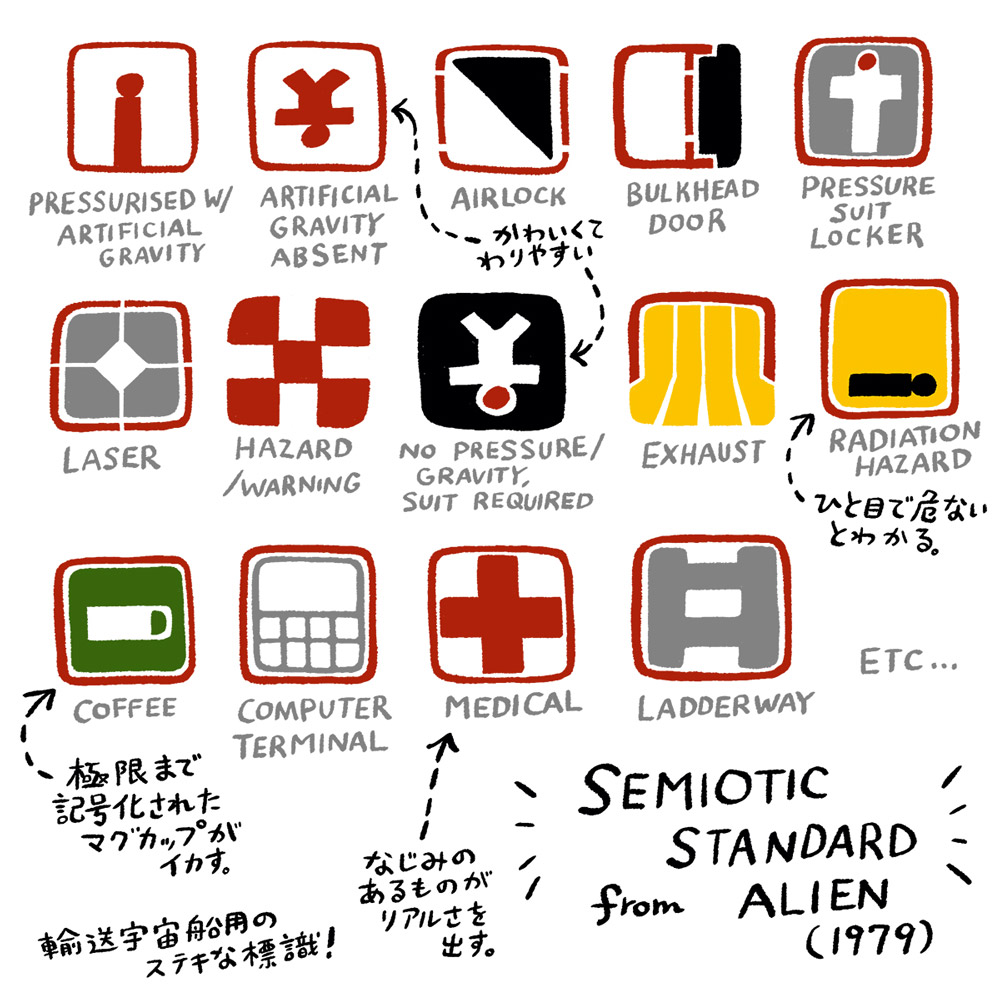
Nice space sign semiotic standard
His work on Alien (based on the original story and screenplay by Dan O'Bannon) is a landmark in Cobb's career. While H.R. Giger created the worldview of nightmarish creatures, Cobb created a contrasting view of the human world: the exterior and interior of the spaceship Nostromo. Since the two were building completely separate worlds, they were separated during production so as not to influence each other. The result is a stunning contrast between the spaceship and the Alien invading it.
What I would like to draw your attention to is the square sign that can be seen inside the Nostromo, which was also designed by Cobb. The text accompanying Cobb's sketch reads: "Standard Symbols for Commercial Interstellar Transport and Heavy Element Transport Vessels (Semiotic Standard)" (which is graciously dated "April 26, 2078"). ), in short, it is a pictogram inside a spacecraft. The stylish symbols may seem strange at first glance, but they are well-crafted because they make you understand when you compare the captions and diagrams.
If the human figure is standing upright, it means artificial gravity is working, if it is upside down and its limbs are spread out, there is no artificial gravity, and if one side of the figure is completely black, it is in an airlock, a bulkhead, or a yellow background. Some are spaceship-like, such as radioactive hazards if a humanoid is lying down, while others are normal, such as coffee, computers, and medical (usually a Red Cross). I feel like we can get a glimpse of one of the elements of life on board the Nostromo.
I get the impression that they are creating it with not only the subject in mind, but also the idea and environment behind it, in other words, the setting. It goes beyond simply drawing a spaceship; it also focuses on the world in which the spaceship exists and the life inside the spaceship. Above all, I think he is a professional at being able to design not only cool spaceships but also pictograms like this.
Each sign has a red frame, and a white frame surrounds the outside (the white frame is omitted in the illustration), which seems to be a device to make it stand out regardless of the color of the spaceship's walls. I can't believe that he not only tries to convey meaning through symbols, but also considers their visibility. He literally designed an entire spaceship.
Follow official SNS
