(C)2018 Twentieth Century Fox Home Entertainment LLC. All Rights Reserved.
"The Grand Budapest Hotel" Three loves brought out by outstanding aesthetic sense and craftsmanship
2019.08.11
Numerous “games” that will delight cinephiles
As I mentioned earlier, the biggest feature of this work is that it appealed to both ``cinephiles'' and ``light fans.'' If the ``stylishness'' appealed to the cinephiles, what attracted cinephiles was the elaborate ``composition'' and ``quotes from past movies.''
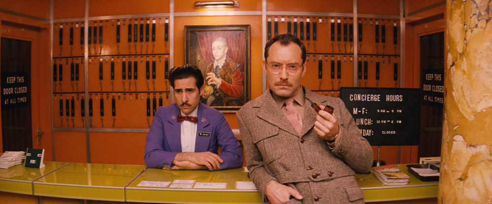
The Grand Budapest Hotel is set in three eras. 1932, 1968, and 1985 (this is where the "present" story is interposed). Aspect ratio was used to express differences between eras. Roughly speaking, it is the aspect ratio of the screen. The unique method of allocating standard size (1.33:1), Vista size (1.85:1 *American Vista), and Cinemascope size (2.35:1) to each era to differentiate them is adopted.
The standard size was the main ratio in the silent movie era, and recently became a hot topic when it was adopted in `` A Ghost Story' ' (17). Simply put, it can give the audience an old-fashioned impression. Vista size is also common for Japanese movies, and CinemaScope size (cinesco) is a horizontal standard. If it's Vista size, you'll have a "normal sense of security," and if it's Cinemasco size, you'll have a "feel of scale." Even if you don't pay particular attention to the aspect ratio, your impression is being manipulated unconsciously.

"The Grand Budapest Hotel" (C)2018 Twentieth Century Fox Home Entertainment LLC. All Rights Reserved.
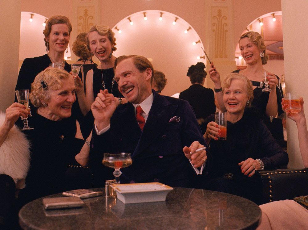
It's a play that only director Wes Anderson, who himself is quite a cinephile, can bring to the table, and he is not only an idea man, but also a very smart architect. The book related to this film, `` Wes Anderson's World : The Grand Budapest Hotel '' (published by DU BOOKS), includes part of the storyboards and script drawn by director Wes, but the camera movements, composition, Everything from the costume instructions to the atmosphere on screen is extremely detailed. According to Ralph Fiennes, who played the legendary concierge, there were clear instructions regarding the speed of the dialogue, and it is clear that every scene was created through careful calculations.
It's true that director Wes' films are full of conventions. The camera moves in parallel, the lines suddenly zoom in, the lines are spoken quickly, the music is constantly playing, and it stops for a moment when someone tells a joke, and when something happens, there is a moment before the character suddenly starts moving. There are quite a lot of cuts (cuts change approximately every 5 seconds in this work), etc.

"The Grand Budapest Hotel" (C)2018 Twentieth Century Fox Home Entertainment LLC. All Rights Reserved.
However, at the same time, director Wes was never too presumptuous and often asked the cast for their opinions when developing characters. He communicated his goals and intentions when it came to music, costumes, and art, and enjoyed collaborating with the ideas that each staff member brought to the table. From these episodes, we can see that he is a person who creates things organically after establishing a solid foundation. His great appeal lies in his originality and collaborative nature, which cannot be categorized simply as a ``writer.''
As a side note, director Xavier Dolan's ` `Mommy '' (14) is famous for incorporating the difference in aspect ratio mentioned above. This work uses an unusual ratio of 1:1, and the story unfolds on a square screen. Furthermore, when the ``emotions'' of the story rise, the screen expands to Vista size, creating a sense of freedom and dynamism. ``The Grand Budapest Hotel'' whose ratio changes depending on ``age'' and ``Mommy'' whose ratio changes depending on ``emotion.'' Coincidentally, it's also fun to compare the two, which were both released in the same year, 2014.

